
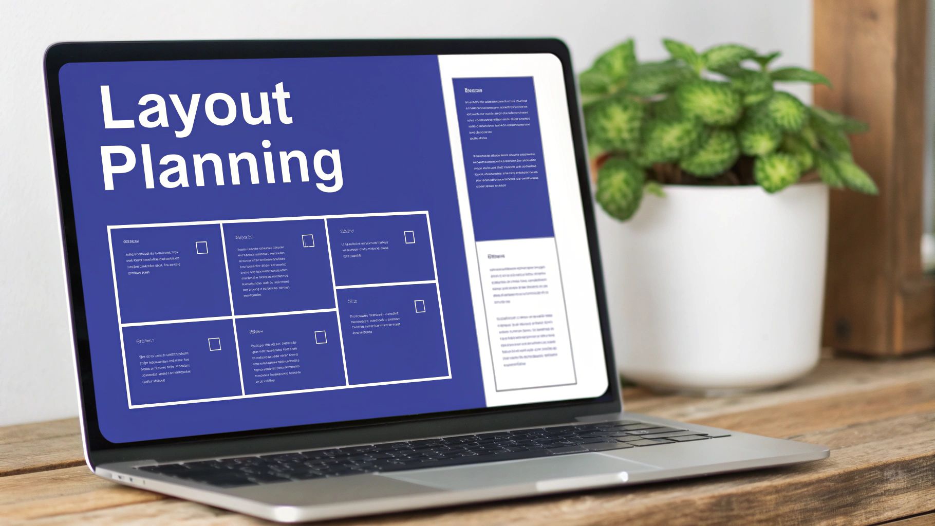
Understanding Website Editing Fundamentals
Your website is like a physical store that needs regular maintenance and updates to stay relevant. Making strategic improvements to design, content, and functionality helps create an engaging experience that keeps visitors coming back. Regular website editing isn't just about fixing what's broken – it's about actively improving your online presence to better serve your audience.
Key Considerations Before Editing
Before diving into website changes, you need a clear strategy. Define specific goals for what you want to achieve, whether that's boosting sales, engaging users better, or refreshing your brand identity. Take time to research your target audience and what they're looking for. And most importantly, evaluate your current website performance to identify problem areas like slow loading, navigation issues, or outdated information that need attention.
Choosing the Right Editing Approach
Website editing tools range from beginner-friendly to highly technical. Content Management Systems (CMS) like WordPress, Wix, and Squarespace make it easy to update content without coding knowledge. For more advanced customization, you may need to edit code directly using HTML, CSS, and JavaScript. Visual editors offer a middle ground, combining ease-of-use with more flexibility than basic CMS platforms.
The Importance of Continuous Improvement
Regular website updates are essential for long-term success online. This means actively monitoring performance, gathering user feedback, and making data-driven improvements. The growing demand reflects this – web design professionals are seeing 16% annual job growth through 2032, with 19,000 new positions opening yearly. The industry has reached $11 billion in value, and the U.S. will need 229,000 web developers by 2032 (Source). These numbers show just how vital skilled website maintenance has become. Success requires staying current with web standards while continuously refining the user experience based on real data and feedback.

Mastering Essential Tools and Platforms

The success of your website editing work depends heavily on choosing and using the right tools. Professional designers carefully select specific tools based on each project's unique needs and requirements. By making smart choices about which platforms to use, you can expand your editing capabilities while avoiding frustrating technical limitations.
Key Platforms and Their Specialties
Different website projects call for different platforms. Here's how some popular options compare:
| Platform | Best For | Key Features |
|---|---|---|
| WordPress | Content-heavy sites | Flexibility, extensive plugin library |
| Wix | Small business websites | Ease of use, drag-and-drop editor |
| Squarespace | Design-focused websites | Design templates, integrated e-commerce |
Each platform has distinct advantages that make it ideal for certain types of sites. For example, WordPress excels at managing large amounts of content and offers thousands of plugins to add new features.
Proven Workflows and Multi-Tool Integration
Smart designers often combine multiple tools to create an efficient workflow. You might start with Figma for initial design mockups before moving to WordPress for the actual build. This flexible approach lets you adapt your tools as project needs change.
- Start with a wireframe: Use tools like Figma or Sketch to map out designs
- Develop with a CMS: Build the actual site using WordPress or Squarespace
- Optimize with SEO tools: Improve rankings using tools like Yoast or SEMrush
As your websites grow more complex, it becomes crucial to add tools that automate repetitive tasks like content updates and site analytics. This frees up time to focus on creative design work.
Tips from the Pros: Choosing Your Tech Stack
Experienced web designers recommend these key principles when selecting tools:
- Stay informed on updates: Keep track of new features that could improve your work
- Focus on compatibility: Pick tools that work well together to avoid workflow issues
- Prioritize flexibility: Choose solutions that make it easy to modify designs later
By carefully selecting and mastering the right combination of tools, you'll build websites more efficiently while maintaining the flexibility to adapt to changing project needs. The key is finding tools that enhance your creative process rather than limiting it.
Creating Exceptional Mobile Experiences
Mobile design has fundamentally changed how we build websites. Success now depends on creating smooth, engaging experiences that work beautifully on phones and tablets. Top designers know that mobile users have unique needs and behaviors that must shape every design decision.
Testing Beyond Responsiveness
A mobile-friendly website requires more than just flexible layouts. You need to evaluate the complete user experience across different devices, screen sizes, and operating systems. Touch-friendly navigation means creating buttons large enough for fingers to tap accurately and menus that work smoothly with one hand. Speed is critical too – mobile users expect instant access to content and will quickly abandon slow-loading sites.
Mobile-First Content Presentation
The mobile-first approach flips traditional design on its head. By designing for phones first and scaling up to larger screens, you ensure content works perfectly on smaller devices. This means prioritizing essential information, using clear visuals, and creating intuitive navigation patterns. The result? Cleaner, more focused websites that deliver better experiences on all devices.
The numbers show why mobile optimization matters. As of May 2023, 65.49% of global website traffic comes from mobile devices. Even more striking, phones attract 65% of new users and 74% of returning visitors. To reach most of your audience effectively, mobile must be a top priority. For more insights, check out HubSpot's web design statistics.
Touch-Friendly Navigation and User Interaction
Making mobile work means understanding how people actually use their phones. Consider natural thumb movements and one-handed browsing patterns. Use familiar touch gestures like swipes and taps. When possible, minimize typing on small screens by adding features like auto-complete. Small improvements to interaction design can dramatically improve the mobile experience.
Examples of Successful Mobile Transformations
Many businesses have seen remarkable results after putting mobile users first. Simple changes like streamlined navigation and faster load times often lead to higher engagement and lower bounce rates. These success stories prove that smart mobile design directly impacts bottom-line results. In today's connected world, excellent mobile experiences aren't optional – they're essential for growth and success.
Transforming User Experience Into Conversions
Building a website that turns visitors into customers requires both creative vision and analytical thinking. The most effective websites combine data-driven insights with thoughtful design to create experiences that resonate with users. In fact, 80.8% of websites undergo redesigns specifically to boost low conversion rates, showing just how vital good design is for business results (Learn more about web design impact).
Understanding User Psychology and Design
Good web design connects deeply with how users think and behave. When a website offers clear, natural pathways for users to follow, they're much more likely to take desired actions. Simple navigation and smart placement of key elements can dramatically boost conversion rates. The key is creating a layout that feels natural and guides users smoothly toward their goals.
Identifying and Eliminating Conversion Barriers
Finding and fixing what stops users from converting is essential for better results. Here's how to spot and solve these issues:
- Run user tests to get direct input on problem areas
- Study heatmaps to understand user behavior patterns
- Test different versions of design elements to find what works best
By tackling these obstacles head-on, you can turn potential roadblocks into opportunities for better engagement.
The Art of Persuasive Design
Creating persuasive designs means building interfaces that encourage action while staying honest with users. Effective designs typically use:
- Strategic colors to create emotional connections
- Clear visual priorities to highlight important elements
- Clean, focused layouts that keep users engaged with what matters
Practical Frameworks for Optimization
Making your website better is an ongoing process that needs constant attention and testing. Looking at metrics like bounce rates and user paths shows you exactly what needs work.
Want to learn more? Check out practical ways to get website feedback for proven strategies and tools. By regularly refining your design based on real data, you'll create an experience that not only attracts visitors but turns them into loyal customers.
Implementing Strategic Content and SEO Practices
Every successful website needs content that works on two levels – appealing to both search engines and real people. Creating content that ranks well while genuinely helping your audience is both an art and a science. Let's explore how to master this balance.
Structuring Content for Both Search Engines and Users
Good website structure acts like a roadmap for both visitors and search engines. Just as you'd organize a store with clear sections and signs, your website needs logical categories and subcategories that make content easy to find. Use heading tags (H1, H2, H3) to create a clear hierarchy – this helps search engines understand your content while making it more readable for visitors. When people can quickly find what they need, they're more likely to stay on your site.
Keyword Integration Best Practices
The key to effective keyword use is being natural and strategic. Search engines have become sophisticated at detecting forced or excessive keyword use, which can hurt your rankings. Think of keywords as signposts that guide visitors to your content – they should fit smoothly into your writing. Rather than cramming in phrases like "how do you edit websites," weave them naturally into helpful, informative content. Focus on answering real questions your audience has.
Maintaining a Consistent Brand Voice
Your website's voice should reflect your brand's personality and values. When visitors read your content, they should get a clear sense of who you are. Whether your tone is professional, friendly, or somewhere in between, keep it steady across all your pages. This builds trust with your audience and helps them connect with your brand on a deeper level.
Creating Content That Converts
The best content does more than inform – it sparks action. Understanding what motivates your visitors helps you craft content that guides them toward taking the next step, whether that's making a purchase or signing up for updates. Want to learn more about gathering user feedback? Check out How a Website Feedback Tool Helps Product Managers Manage Internal Feedback. Clear calls-to-action and strategic content placement can significantly boost your conversion rates.
By following these content and SEO best practices, you'll create a website that not only attracts visitors but keeps them engaged and moving toward your goals. Remember that good content serves both search engines and users – when you nail this balance, your website becomes a powerful tool for growth.
Safeguarding Site Security and Performance

A website's success depends on both its visual appeal and technical foundation. Even a one-second delay can reduce conversions by 7%, making site performance critical for engaging users. That's why monitoring your site's health through advanced tools is essential – they provide real-time data so you can fix issues before users notice them.
Monitoring and Automated Security Protocols
Smart security systems protect your site around the clock without constant manual oversight. The key elements include:
- Firewall protection: Blocks harmful traffic before it reaches your site
- SSL certificates: Keeps user data safe through encryption
- Regular backups: Preserves your content if something goes wrong
Setting up automatic alerts for suspicious activity helps you stay on top of security without having to constantly check manually.
Optimizing Site Speed
Users expect lightning-fast websites, and search engines reward speed with better rankings. Here's how to keep your site quick:
- Image optimization: Make images web-friendly without quality loss
- Lazy loading: Load content only when visitors scroll to it
- Minified code: Remove unnecessary characters from code files
These techniques create a smooth, fast experience that keeps visitors engaged.
Practical Checklists for Maintenance
Regular site check-ups prevent problems and keep everything running smoothly. Make sure to:
- Run security scans: Look for weak points before others find them
- Keep software current: Install updates promptly to patch security holes
- Review analytics: See how users interact with your site
This proactive approach helps catch issues early, saving time and protecting your site's reputation.
For teams looking to simplify feedback and collaboration, BugSmash offers a central place to collect and track site improvements. Share annotated screenshots easily and turn feedback into actionable tasks that move your website forward.